 |
| A Clockwork Orange, Anthony Burgess, 1962. On the other hand, it is this 1972 iteration of Burgess’s classic novel, designed by David Pelham, that has truly become iconic. The dust jacket of the first edition, at least in our minds, leaves something to be desired. |
 |
| In Cold Blood, Truman Capote, 1966. When designer S. Neil Fujita first showed his bright red hatpin cover idea to Capote, the author had a quibble. “It can’t be red, because it wasn’t a new death, it didn’t just happen,” he complained. So Fujita changed the color to purple, and added a “funereal” black border, which pleased Capote immensely. |
 |
| Lolita, Vladimir Nabokov, 1955. Though Lolita has appeared in hundreds of incarnations, this juicy 1973 cover (with that luscious, looping ‘L’) is probably the most beloved. Discounting those emblazoned with the heart shaped Kubrick glasses, of course. |
 |
| On The Road, Jack Kerouac, 1957. This cover, from the first British edition, was designed by Len Deighton, who became a prodigious author in his own right. We just can’t get over all that text on the left: “Liquor, Girls, Fun, Jazz” — Would it be so wrong to add an “Oh my!”? |
 |
| Psycho, Robert Bloch, 1959. Like The Godfather, Tony Palladino’s cover art for Psycho made it to the promotional material for the big-screen adaptation, which has added to its iconic status. However, we contend that the enormous, sideways, slashed-through title would have held up on its own, Hitchcock or no Hitchcock. |
 |
| One Flew Over the Cuckoo’s Nest, Ken Kesey, 1962. Another design by the prolific Paul Bacon, who is clearly playing with colors. |
 |
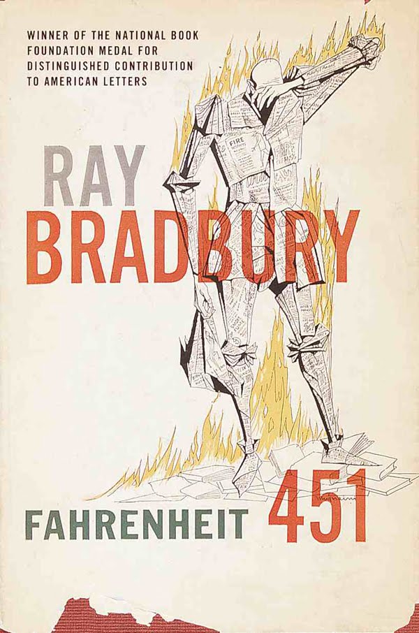
| Fahrenheit 451, Ray Bradbury, 1953. Designed by Joe Pernaciaro, this cover has never ceased to frighten us. |
0 comments:
Kommentar veröffentlichen